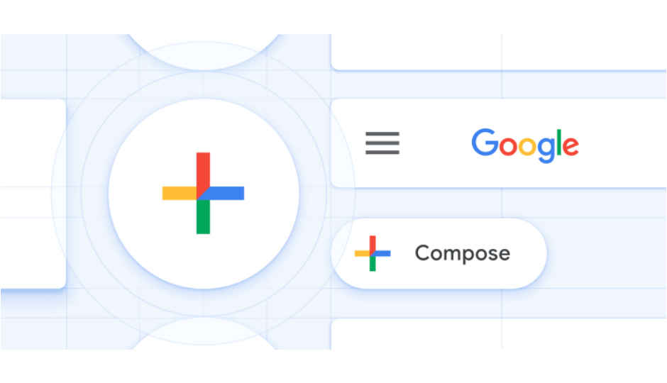
 Highlights: Google starts rolling out Material Design theme for Gmail on Android. The update will be extended to iOS in the coming weeks. It brings features like Smart Compose and Smart Reply. Google has been painting all its services white signifying its Material Design theme and Gmail for Android is the latest app to get the Material Design treatment. Google says that this theme is a visual language that combines good design with the innovation of technology and science, and is developed to give users a unified user experience across platforms, devices, and input methods. Material Design theme on Gmail for Android is a “gradual rollout,” and in the coming weeks, the update will be extended to iOS. “Today, we’re kicking off the year with a new look for Gmail on mobile, too. As part of the new design, you can quickly view attachments—like photos—without opening or scrolling through the conversation. It’s also easier to switch between personal and work accounts, so you can access all of your emails without breaking a sweat. And just like on the web, you’ll get big, red warnings to alert you when something looks phish-y,” Google said in a blogpost. According to the company, this update is part of a larger effort “to make G Suite look and act like a family of products, designed in the Google Material Theme with ease-of-use in mind.” Notably, the company has already rolled out the update to the web experiences for Gmail, Drive, Calendar, and most recently Google Docs and Sites. Google also says that the Gmail on iOS will get this refresh “in the coming weeks,” and more G Suite mobile apps will get the design later this year. The update to Gmail for Android brings features from the web app to the mobile app. Some of these features were previewed at the Google Cloud Next conference in San Francisco last year. Now, Android users can also take advantage of the machine learning-based Smart Compose feature on Gmail, or reply to messages quicker with suggested responses generated by Smart Reply. Users can also follow up on emails with reminders in the inbox as well. We haven’t got the update till now, but as showcased by Google last year, Gmail’s thick red accents are gone. There is a search bar on the top that features the navigation drawer on the left and a profile avatar at the right. At the bottom-right is a new multi-colored Floating Action Button (FAB). The new inbox view also lists images, files, and other attachments for quick access. Most recently, Google brought the Chrome OS version 69 with Material Design. Related Read: Google Photos is the latest app to get Material Design Google Maps added to list of apps with new Material Design
from Latest Technology News http://bit.ly/2RqrRba
No comments:
Post a Comment