I wanted to start this review by ranting about the whole “Cheeni Kum” pre-launch marketing tactic by Micromax obliquely aimed at the Chinese smartphone brands in India. The rhetoric was blatant: milk the burning wave of nationalism in India to kick the Chinese companies out of the country. If you ask me the approach was pushing things a bit too far. However, I took a step back and realised that I was being naive.
There’s no better way to build hype for an Indian brand than to stroke the jingoistic tendencies of people. It’s a proven method for success. And, fun fact: Micromax has done this in the past. It did it back in 2016 with Kapil Sharma’s #Angrezipanti ad. It is doing it again in 2020 with the Micromax In Note 1.
Also read: Micromax In Note 1 First Impressions: In for INcredible?
But, does all that matter? No. All that initial hype will lead to nothing if the product is no good.
So, is the Micromax In Note 1 worth your time and money? And, was my experience any different from the first batch of retail units that have started reaching consumers? Well, I am here to cut through all that noise and get to the point.
Micromax In Note 1 Design: good ergonomics but doesn’t feel sturdy
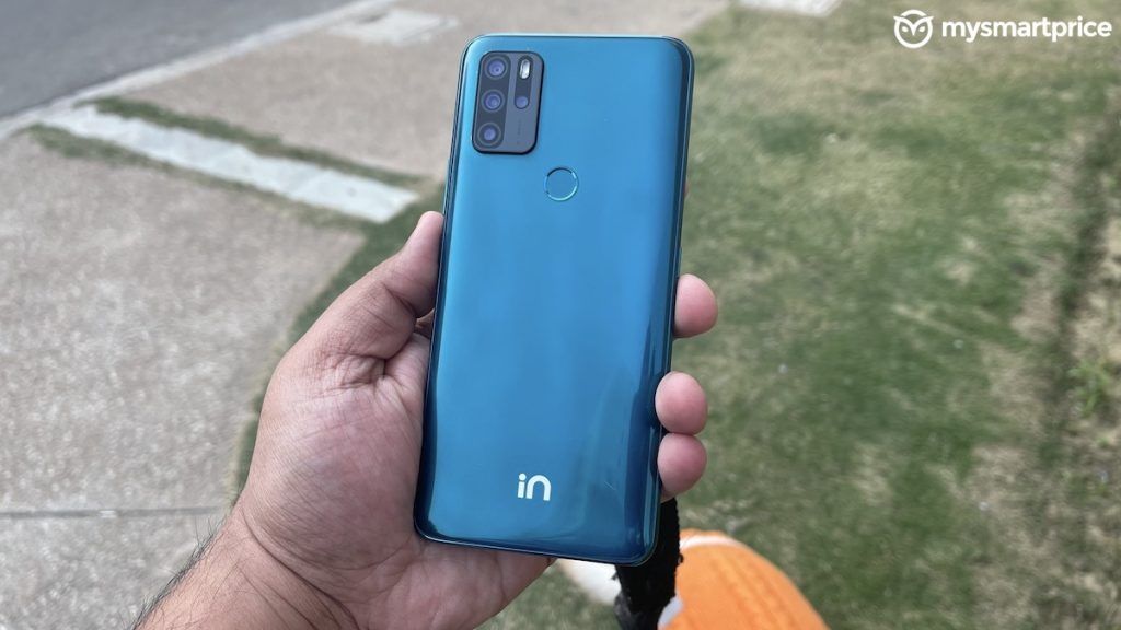
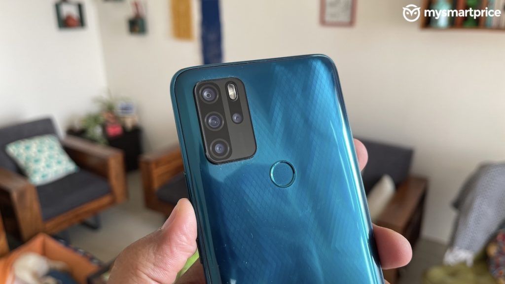
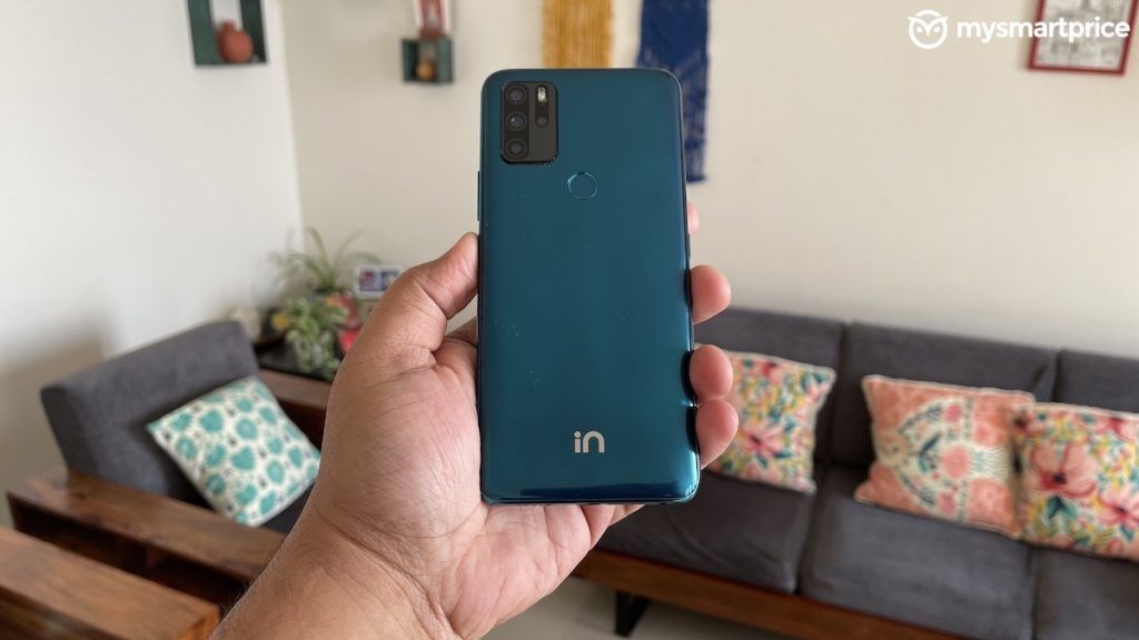
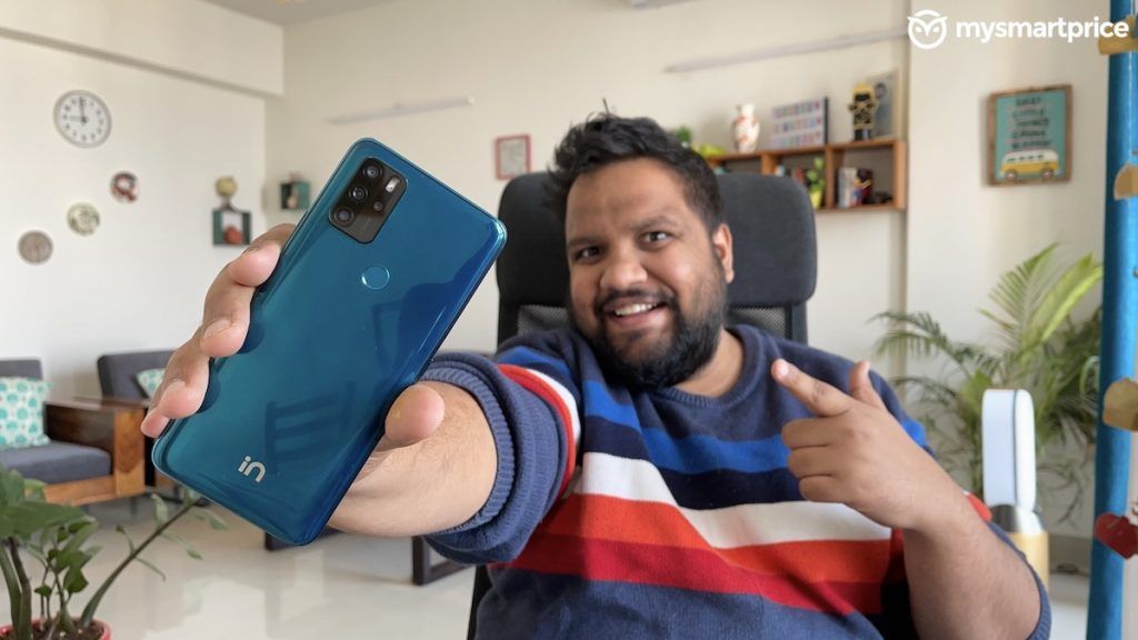
The In Note 1’s design follows the same tropes promulgated by Chinese brands to begin with. The plastic back has a flashy gradient design with a box-shaped OnePlus 8T-ish camera module. This module juts out of the rear and wobbles on a surface. Anyway, the back has this X-shaped pattern that plays peekaboo with the light and is only visible at certain angles. Also, the In logo at the bottom looks deceptively similar to Linkedin’s logo. So much so that, a few people actually thought that Linkedin was making a phone.
Furthermore, on the rear, you get a physical fingerprint scanner. It is not the fastest but fast enough and effective at unlocking the phone. There’s also the slightly more insecure Face Unlock mechanism and that is fast too. What I like about the design is the back curves gently into the plastic frame making it very comfortable to hold and use. Although yes, it is not a unibody design because the display sits on a separate frame that protrudes a fair bit on the front. You can feel the step design distinctly. The edge of the display frame has a pretty sharp fall and I’d have preferred a 2.5D curved design for a smooth transition while sliding from the display to the frame.
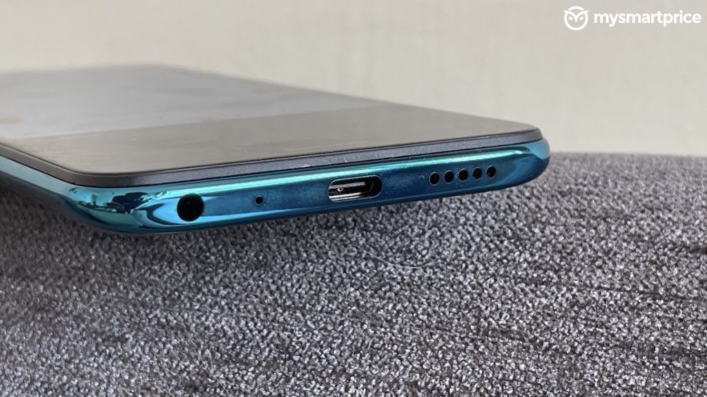
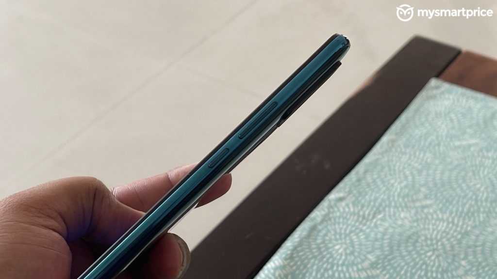
Moving on, you get a power button and a volume rocker on the right edge. There’s also a Google Assistant button on the left one. Yup! You read that right. I like it! All of these offer pretty good tactile feedback and a nice clicky sound when pressed. At the bottom you get the 3.5mm jack, a Type-C port, and a single mono speaker. The Type-C port is of the USB 2.0 spec for those wondering. By the way, the left edge is where you’ll find the tray with two dedicated slots for Nano-SIM cards and a slot for the microSD card.
Honestly, the In Note 1’s ergonomics are great. And, I particularly like the fact that Micromax has managed to keep the weight to below 200 grams.
However, the build quality is definitely circumspect. I could hear the rear panel creak when pressed lightly. While my phone was fairly intact for the duration of the review, there’ve been a lot of complaints about the initial batch of retail units. So, we could be looking at quality control issues in general. Thankfully, Micromax has been pretty proactive about addressing issues so let’s see how it responds. I’d suggest you use the phone with a case, though.
Micromax In Note 1 Display: better than most
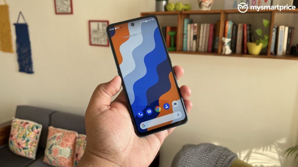
The In Note 1 has an IPS LCD panel. And, I am glad that, unlike many brands in this segment, Micromax doesn’t scrimp out on the display resolution. You get a proper FHD+ resolution with 60Hz refresh rate and not just a paltry 720p setting. Unfortunately, I couldn’t get the make of the glass protection on top of the display. However, it does seem to be pretty resistant to scratches in the limited time that I have spent with it.
There are a few things you should know. Despite offering FHD+ resolution, Micromax hasn’t acquired the Widevine L1 certification. Which means, you are going to end up streaming in HD+ resolution on Prime, Netflix, Hotstar and more. That said, the panel itself has a peak brightness of 450 nits and it remains fairly legible even under harsh sunlight. However, as is the case with most Stock Android phones I’ve used, the adaptive brightness setting is pretty erratic. There were times when it got too bright indoors or too dull outdoors.
The thing with most budget phones is brands use inferior quality LCD panels with light bleed around the edges. And, I am super happy to report that the Micromaac In Note 1 is actually one of the cleaner panels I have used in this price range. I faced no light bleeds or colour shifts either. Plus the default temperature was close to neutral. The display is one of the stronger points of the In Note 1. Adding Widevine L1 support would’ve sweetened the deal. I hope you are reading, Micromax.
Also a part of the display experience is the vibration feedback. The In Note 1 uses your garden variety motor that can rattle the phone’s body so hard, the sensation will pass from the tip of your finger into your veins and engulf your entire soul! I switched it off. On the flipside, the oleophobic coating on the In Note 1 is better than some Realme phones I’ve tested in the past. So, that’s great.
Micromax In Note 1 Software: the USP
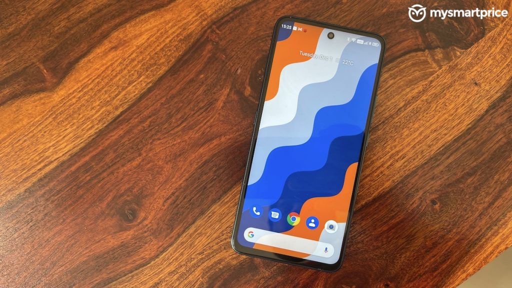
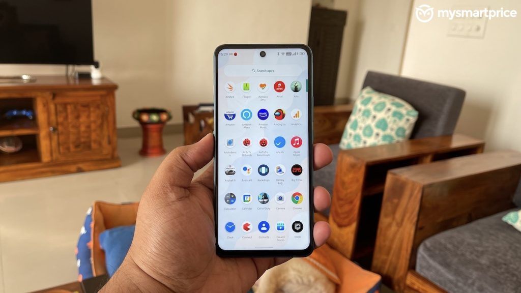
If there is one reason why I will absolutely recommend the In Note 1 to anyone is the near-stock Android experience you get on the phone. It is absolutely bloatware-free and lightweight as well. Now, I say near-stock because there are a few alterations.
For example, the Quick Settings UI in the Notifications Shade looks different. Additionally, there is an Intelligent Assistance feature here that gives you a host of gesture-based features and more.
The Three Finger Screenshot from this feature set was faced with some controversy. Essentially, switching it on meant the display would lose its multitouch capability. Thankfully, a simple software update fixed the problem. Micromax was quick to address the issue. Plus, the update also brought along with it the November security patch. Not bad, Micromax. Not Bad! Also, I faced no other bugs as such.
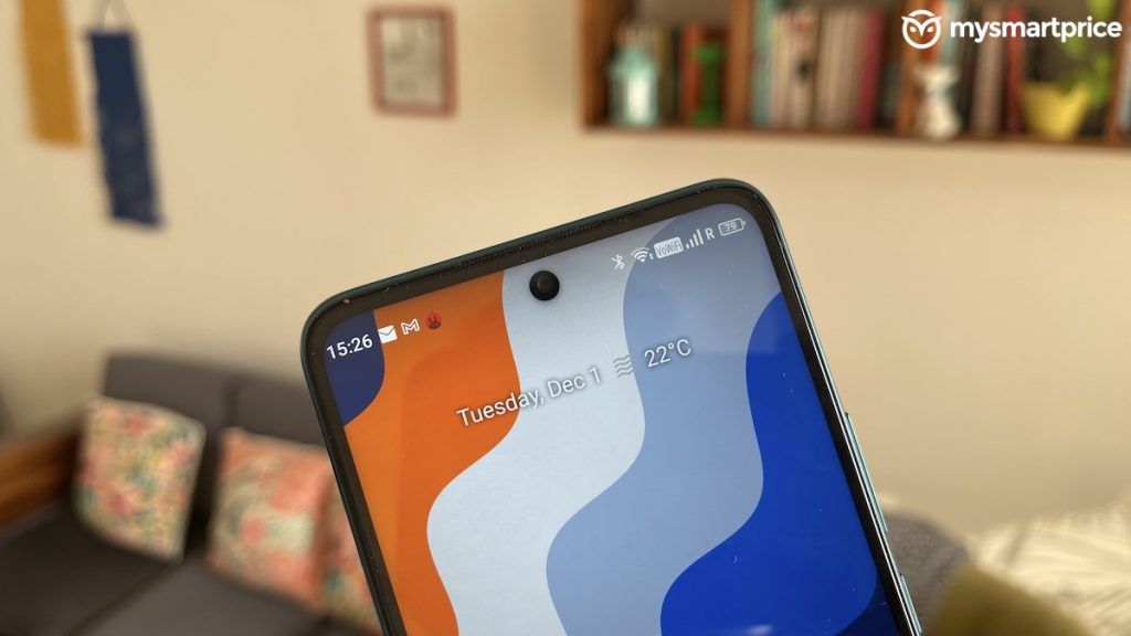
That said, a few things did irk me. Especially, some of the visual elements and the UI design are an eyesore. For example, the clock on the top bar sticks too close to the corner and there’s not enough padding. The text on the VoWIFI icon is stretched too. Certain apps with long names in the app drawer cause a line break moving a single letter to the second line. If you are even a little serious about design, you are going to find this super irritating like I did. If not, this won’t matter to you.
My question is – why break something which ain’t broke? These forced design alterations only break away from an otherwise refined experience. I am cool with adding features but if Micromax’s idea was to add their own visual identity, they will have to relook the whole approach.
The design nitpicks apart, I am more than satisfied with the software experience. It is clean and doesn’t have ads unlike Redmi phones. That is such a big relief.
Micromax In Note 1 Camera: the weakest link
The In Note 1 has four cameras on the rear: a 48MP main sensor, 5MP ultra-wide, 2MP macro and depth. The camera performance was very erratic and not very reliable. There were times when it could take good pictures but those situations were far and few in between.
Let me break down my shooting experience with the In Note 1:
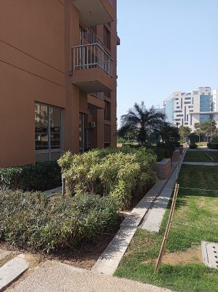
- In daylight shots, you will find muted colours from the camera. And, these are unnatural colours, mind you. Plus, you will notice a lot of oversharpened details as well when you pixel peep. Micromax could’ve toned down on the sharpening. Most pictures end up looking unnatural as a result. Furthermore, in many conditions you will notice overblown highlights as well. Also, please note that if you have a moving subject you will almost always get blurred shots. The camera has slow focussing speeds.
- Interestingly, Micromax doesn’t give you an auto-HDR option. And, it makes sense considering I really don’t understand what HDR does to images here. It picks up the Blues of the sky. That’s it. There are no visible changes to highlights and shadows. Looks like there is no multistack processing happening here.
- The 5MP ultra-wide is a major letdown. Not only does it look flat, lifeless, and noisy, there’s no colour science consistency either. The details are pretty soft and seriously, if I had to use this phone, I’d never use the ultra-wide camera.
- The 2MP macro camera can take fairly crisp macros as you’d expect from such a sensor. I have no complaints here as such.
- I quite liked the facial tones on my portrait sample but the edge detection is a bit too aggressive. Interestingly, I had to take the portraits in Aperture mode. And, in this mode the camera defaults to 48MP res. At full res, there is no oversharpening and I love that! So, if you get ample light, you can possibly get good portrait shots of humans from the phones.
- Selfies offer good facial tones in daylight shots. In fact, low light selfies are fairly good too. But, Indoor selfies look too muted and oversharpened. Plus, the selfie camera cannot do any sort of dynamic range correction, which is a problem. Selfie portraits are, oddly, softer in details but the edge detection is not too shabby. Overall, the selfie performance, though inconsistent, could get you good results if you are patient.
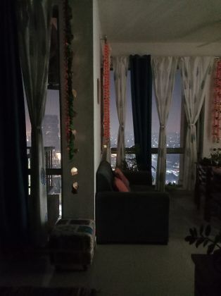
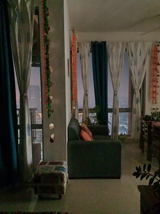
- One area where the camera surprised me is with its low light performance. The Night Mode is actually pretty decent. The algorithm works around the limitations of the sensor and makes good looking images. The Night Mode doesn’t focus on only making the pictures bright, it fixes the flaws in the regular shots. For example, in this shot you can clearly see that the overexposed Diwali lights on the building have been fixed to look good. However, when it gets too dark, as you can see in the second low light sample, the Night Mode adds green aberration to the noise. But, that’s part and parcel of a budget camera experience.
- In video recording, the In Note 1 takes a drastic hit. You don’t get any stabilisation in 1080p 30fps videos. Plus, the audio recording is really bad. The details are soft and you can notice noise in the shadows as well. This is definitely not a good video shooting experience on the phone. The colours from the front camera’s video recording is alright. The facial tones are especially great. But again, there’s no stabilisation on offer and the audio recording quality is not very good either.
A few issues can be fixed with a better software algorithm and I hope Micromax can do that for the In Note 1. Maybe, a GCam build for this phone in the future could solve your camera woes. Let’s wait and watch.
Micromax In Note 1 Performance: few stutters but largely alright
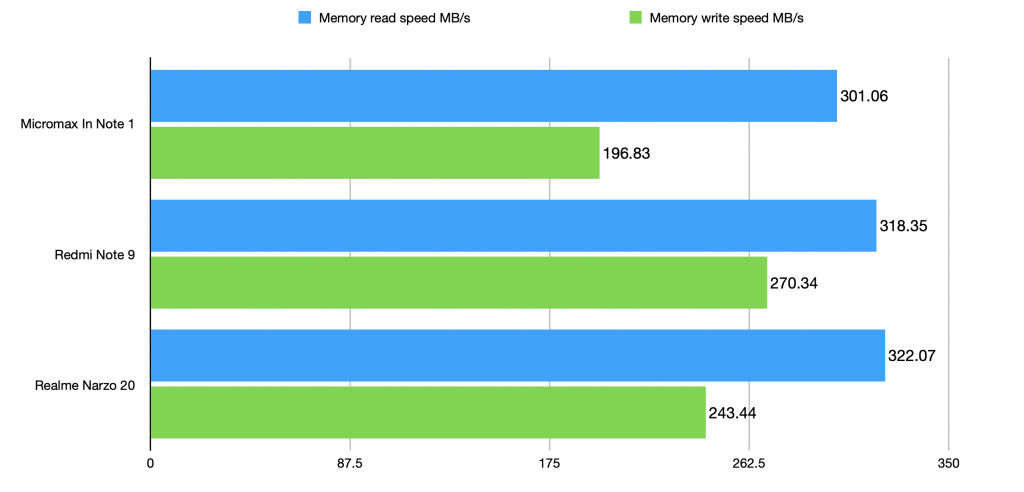
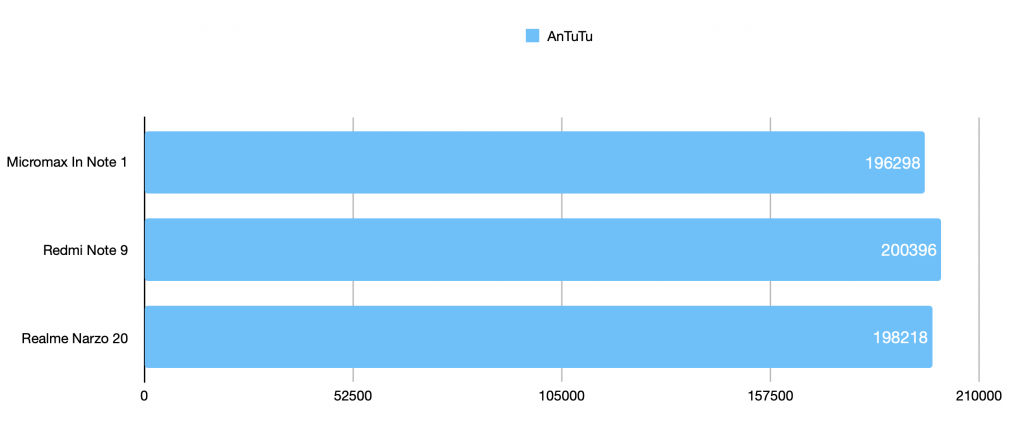
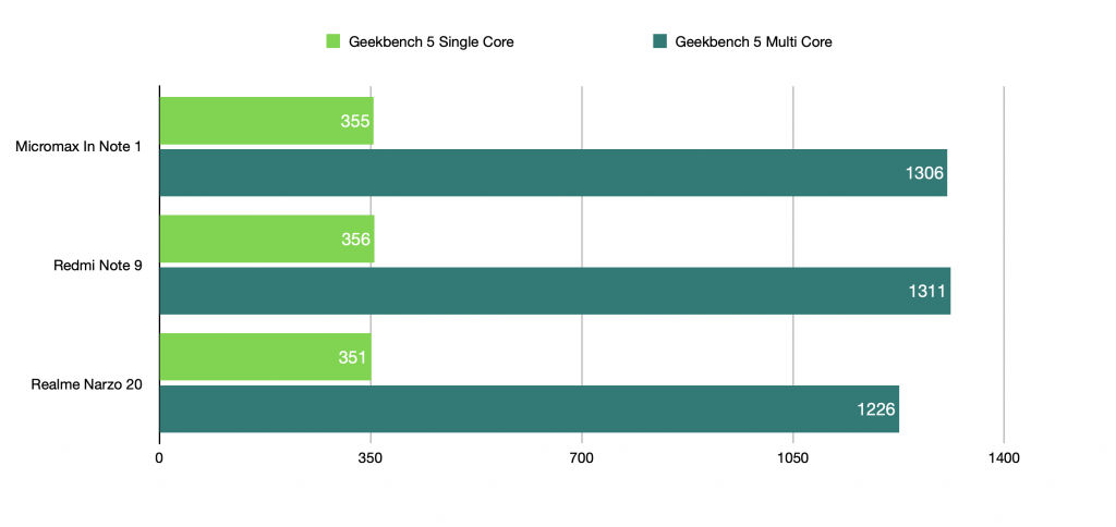
The In Note 1 uses Mediatek’s Helio G85 SoC. It is possibly the most powerful chip you can buy in this price range now. And, for the most part that is true. The benchmark numbers are in the same ballpark range as the Redmi Note 9 and Realme Narzo 20. You can take a look at the AnTuTu, Geekbench, and Androbench storage benchmark comparisons below.
Now, these synthetic benchmarks only give you an indication of the performance. In real life testing, I found the In Note 1 was fairly good in daily usage. There were some stutters here and there. And, I believe this is largely due to the average hardware and software optimisation. Thanks to the light OS, when it doesn’t lag occasionally, my daily usage experience was nimble and smooth.
Most importantly, I was impressed with the gaming performance. No, it is no beast. But, I enjoyed playing rounds of COD with it even at Medium settings. Mostly because the touchscreen experience was great and the gameplay was lagfree. To stress test the phone, I did play the game for an hour and it did heat up to around 43 degrees. However, that is normal and on par with the competition.
Coming to the mono speaker at the bottom, it can get really, really loud. But, it does sound hollow due to the hollow bass. Now, the phone also comes with a 3.5mm port and I tested it with my 1More Triple Drivers. Well, they sounded pretty average and the sound was not dynamic at all. These are a fun sounding pair of earphones, but the In Note 1 couldn’t bring out the life in the sound, unfortunately. Wireless audio performance was largely similar. Essentially, don’t expect the phone to wow you in the music department and you should be fine.
Micromax In Note 1 Battery Life and Network Quality: good enough
The In Note 1 has a large, and now standard, 5000mAh battery inside. I got around 7hrs 30 minutes to 8 hours of SoT on most days. This is on par with my experience on other phones with 5000mAh batteries in this price range. Essentially, it is good. As for the charging speeds, you get support for up to 18W speeds. Unfortunately, the charging situation is a little weird.
The 18W charger sometimes fails to fast charge and you won’t know until you notice the indication. So, in my first charge test it took me 3 hours to charge from 0 to 100. This was obviously odd. I tweeted it out and a few helpful reviewers in the community said the 18W charger is slow charging and that I need to redo it. I retried it and fast charged the phone in exactly 2 hours and 29 minutes. This is more in line with 18W charging speeds. However, Micromax needs to ensure general users don’t have to face such issues.
Now, one area where Micromax totally kills it is with the In Note 1’s network performance. You get support for 5GHz Wi-Fi speeds and it works exceptionally well. Plus, I used the phone on Airtel’s 4G network for the entire duration and I got spotless 4G plus VoWiFi. You can also get dual VoWiFi on two different networks as shown in Dhananjay Tech’s video. Plus, the earpiece quality is great and the mic was good too. You also get Carrier Aggregation, which is excellent. It is so vital to highlight when a brand gets this basic use case right. There are quite a few who take it lightly. Thanks, Micromax.
Should you buy the Micromax In Note 1?
Now that we are about to conclude the review, let’s take a look at the pricing. Here’s where Micromax goes for the kill. You get the 4GB/64GB variant for Rs 10,999 and the 4GB/128GB variant for Rs 12,499. This is definitely in line with the pricing of smartphones by other competing brands. Micromax’s approach is crystal clear here. Add the best processor you can find in this price range and club that with stock Android for a smooth usage experience.
And, for the most part that approach works. Yes, there are a couple of bugs and UI design inconsistencies, but nothing that breaks away from the experience. Furthermore, many phones have software bugs. Heck, even iOS 13 was riddled with it. What matters is this is a new, more efficient Micromax we are talking about. A company that is constantly tracking user user complaints and fixing problems in a swift fashion. If it can sustain the same approach, that would matter to the end consumers.
Here’s what Micromax needs to do in its next set of phones:
- Improve the build quality. Fix quality control issues in the assembly line considering the complaints. This is paramount.
- Ensure a relentless commitment to timely software updates and fixing issues.
- Offer good, reliable after sales service.
As for now, in this price range, the Poco M2 is still my favourite phone. You get more RAM, a cleaner ad-free software experience compared to the Redmi Note 9, and a reliable camera experience. But, the In Note 1 is the best option for someone who wants a Stock Android phone with no-nonsense performance. And, for those who want to extend their support to Micromax for being an Indian brand, I see no harm in that either because the product itself is sufficiently good.
And, if anyone is writing off Micromax so soon, then I guess they’d be making a mistake. So, what do you folks think of the phone? Do let us know in the comments section below.
The post Micromax In Note 1 Review: Let’s Cut the Marketing Crap, This is a Sufficiently Good Smartphone appeared first on MySmartPrice.
from MySmartPrice https://ift.tt/3qgxBXU





No comments:
Post a Comment